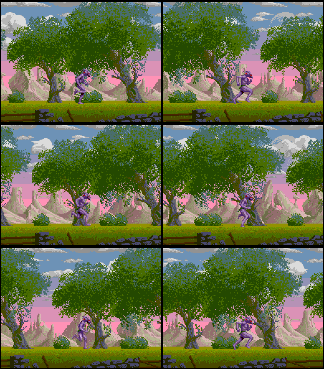
This games been part of my life for some time, I did the PC Engine port of it, and gave some advice on the C64 one, and did a Spectrum Next demo of it. It has always “looked” amazing on lower end platforms, a technical tour de force if you will, though most will agree the gameplay has always lacked.
I thought I’d discuss porting the game to the PC Engine, and the various issues I might have had. I also thought it might be fun to break down the initial level visuals, and show that while it’s actually incredibly simple, it’s also incredibly well thought out. So lets start with the Amiga version first.
First the Amiga version is in Dual Playfield mode (obviously), and much of the background is in one playfield, while the foreground stuff is in the other. On the Amiga, this is pretty simple. The moon in the background is a hardware sprite, as is the “blimp” and the panel, while the wall is again the foreground playfield just scrolling at a different rate.
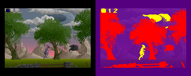
Here you can see the layers broken down. The Amiga has what’s known as a copper list, and this allows you to change hardware registers based on where the video raster is on the screen. Which leads us to how is the screen drawn? A computer display is output from the top left, and then draws left to right, then downwards. There are various “blanking” periods where the “beam” fly’s back to start drawing the next line – or from the bottom to the top. So what the Copper does, is waits for a line, then a horizontal position, then changes values – usually scrolling registers, or in the case of sprites, sometimes the layer priority. This lets us put sprites on top (like the lives), the into the background for the blimp and moon.
This is also true for the scrolling background. While a single bitmap, the clouds and the ground have copper-raster changes to do scrolling at different points, giving about 13 layers of parallax scrolling. The Wall is also the foreground bitmap, and explains when you kill a baddie, it clips into the ground, because if it didn’t, it would overwrite the wall.
Each platform differs, so how does the PC Engine handle the layers – especially as it doesn’t have dual playfield mode
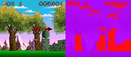
So here you can see with only one playfield, I had to get creative. The panel and the clouds are sprites, with the clouds put into the background, while I had to also make the tree trunks sprites as well so they could go over the hills easily. This does limit the looks of the levels, but it’s fast, and easy. The tree trunks were 64x32s – one sprite each. The beast is also obviously a sprite, as is anything else that needs to appear in front of the mountains – in this case, the wall.
Baddies were also sprites, as was the dragon that flew over at the top. You’ll notice there is no wall here. This is because I had to disable sprites midway through the grass so that baddies would fall “into” grass – just like the Amiga version. This meant I couldn’t use sprites for the wall, and the lack of playfields meant there was no wall here. The colour changes were raster splits – just like colour bars on the C64.
The tops of the trees, the mountains, and the grass were all on the same tilemap layer, with raster splits to change the scrolling speeds.
In retrospect, with the speed of the CPU, it might have been interesting to try and software “mask” the mountains into the trees, this would have meant far more interesting tree trunks and being closer to the Amiga version.
So what about the ZX Spectrum Next version? It ironically looks closer to the Amiga one than the PC Engine version does
This was the second version I’d written due to more hardware becoming available. When I first wrote the demo, I used Layer 2 (256×192, 256 colours) and lowres mode – basically 1/4 res layer 2. This was fine, but then the Spectrum Next team added tilemaps, and this meant I could do a full resolution version.
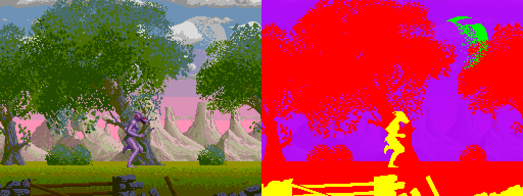
Here you can see the comparison. The parts in yellow are the sprites, tiles are in purple (clouds and mountains), and the pure bitmap layer in red. The moon is the old spectrum ULA screen, held in the “shadow” screen that the Spectrum 128 provides in bank 7 (I think it is).
Now, because this is just a demo, I don’t have to worry about baddies or fitting more graphics in. Currently, the wall takes up a big chunk of sprite graphics, and while I’d have to do a lot of dynamic uploading, I’d have to wonder if the wall could stay. The tilemap is also “packed” with the mountains. What I suspect I’d do is I’d add more repeating sections to reduce tilemap tile count, and that would mean I could use tiles for the wall as well, flipping priorities from back to front using the ZX’s copper, and that would work pretty well. Then I could use all the sprite slots for baddies, and this would make writing the game possible.
Shadow of the Beast is always an interesting challenge for any platform, how you use it’s hardware, if you can flip layers as you got to produce the desired effects. Platforms like the SNES or Megadrive have more than enough hardware to make life simple, but others like the C64 or PC Engine have to be creative..
You can see from this C64 version that the with only one playfield, and limited sprites, different tricks had to be employed. The mountains are limited and repeating. There’s 2 reasons for this, the C64’s limited character set does mean you couldn’t do as complete a job, but the real reason is that the mountains are “anti-scrolled” to slow them down.

Above you can see the what has been done as multiplexed sprites, and as characters. The mountains (in red) are part of the tree trunk scrolling section and if they weren’t anti-scrolled, it would just scroll with the tree trunks, but by scrolling them back by 2 pixels every 2 pixels of the scroll, you get this parallax effect. The tree trunks take up whole characters so there’s no masking involved, the mountains – shown as a 64×48 square bitmap, that is software scrolled by the CPU in an 8×6 character block.
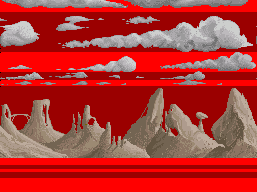
So lastly, how do we smooth scroll the layers? Well here’s the ZX Spectrum Next version, it uses it’s copper to do the screen splits and each band shown here has it’s X scroll value set. The clouds top band start with faster scrolling, the next one slower and so on. That gives the “depth” needed for the scrolling clouds. The mountains are then scrolling slightly slower again, giving some distance from the foreground’s trees. Then we get to the grass. The Next version doesn’t have as many grass layers – more because I just never put them in than for any technical reason, but you can again see that the different bands would allow faster and faster scrolling. The first band under the mountains scrolls at the same speed as the Layer 2 trees, then they get faster and faster until the wall in front goes the quickest.
So there you go…. a little analysis of Shadow of the Beast, and how it gets ported to other platforms. As I said, it’s always an interesting challenge to get Beast onto a platform, sometimes it’s straight forward, other times it’s a real challenge.
